Category wise Donut chart in Tableau
Hello friends! recently I was working on some Tableau dashboards and found a very good usecase of donut charts which can be used multiple ways. Easy to use and visualize. Today we’ll be learning how to create category wise donut chart. I’ve used superstore data for the tutorial.
Category wise donut chart, what exactly this means? Suppose we a have a category dimension with three values A1,A2 and A3 and I want to this values in individual donut charts. So I’ve to use this method to create donut charts otherwise you wont be able to assign the colors. Check out the following steps.
This can be achieved using multiple methods but I’ll show you using Groups and Calculation field method.
Step 1. Create Groups or Calculated fields
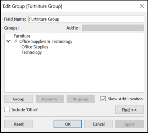
For the first step create groups for the dimension values. Let’s say for furniture create a group in which group the other values. Check the image for reference.
OR for calculated fields create the calculation as below
If [Category]='Furniture' THEN 'Furniture'
ELSE 'Other'
END
Add more calculated fields for more dimension values.
2. Creating donut charts
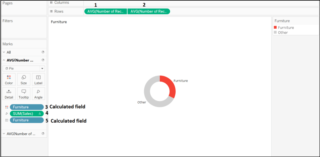
In this step we’ll be creating donut chart in few steps. If you dont know how to create donut chart please go check my tutorial on donut chart here Donut Charts in Tableau. Below are the steps.
a. Put Number of records in rows shelf twice and set the aggregation as AVG.
b. Put the created calculated field or group in color and label.
c. in the last step put the measure you want to see in angle and that’s done.
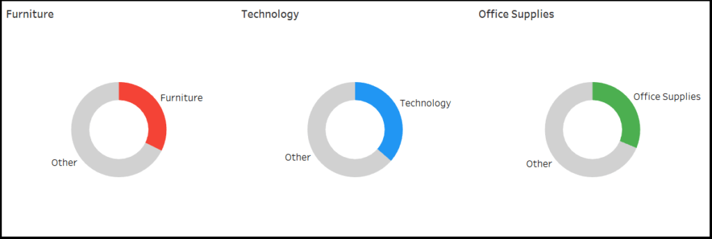
Now repeat the steps for different dimension values and create different sheets. Here I am using Furniture, Technology and Office Supplies.
Now add the sheets to the dashboards according to your need.
This was pretty easy and fast tutorial on how to create category wise donut chart in Tableau.
Comment your queries and suggestions! Also let me know if you know any other method to achieve the same. Share with your friends.
Thanks for reading keep visiting analytics tuts for more tutorials.


Hi Niket,
It was great post, thanks for the same.
But is their any specific use case, since I see we are wasting lot of space by creating three different donuts which can be done in one.
Thanks,
Raj
Hi Raj,
Thanks for your query. In one of my projects I had to use different donut charts for different dashboard and this is way I managed to solve the problem. Please share your queries I’ll be happy to help.
Thanks,
Niket
hi can you please attach the workbook
Thank you Niket Kedia, I have done it ..Very Good One!!!
Hi Manoj,
Can you mail for Workbook? Also click on the image to get the see on Tableau Public.
Thanks
Niket
Hi Niket,
Can you create the single donut chart for showing category wise sales.
Yes, its already created. Download and reuse the dashboard.
Hi,
Will Tableau actions work when you click on the center of donut chart? If it is possible, can you please tell us how?
FYI, Clicking on slices or clicking on the header filters the rest of the dashboard but clicking on the center doesn’t seem to work.