Correlation Matrix in R
Hello friends! Wishing you all a Very Happy New Year 2018!
Today we’ll be seeing the correlation matrix heatmap. Heatmaps are visually appealing with quick and easy to get inference. Follow the quick and easy tutorial.
Install necessary R packages
#----Install Packages
install.packages("ggplot2")
install.packages("reshape2")
library(reshape2)
library(ggplot2)
Read Data
#Reading the data
mydata <- read.csv('https://archive.ics.uci.edu/ml/machine-learning-databases/breast-cancer-wisconsin/wdbc.data',header = F)
head(mydata)
#Read Column 3 to 8 and using it for correlation
data<- mydata[,3:8]
Create Correlation Matrix
Once the correlation matrix is prepared it has to bring in proper format to plot in a chart.
#Create correlation matrix
cordata <- round(cor(data),2)
head(cordata) #This will be a 5X5 matrix with each correlation values
#Melt data to bring the correlation values in two axis
melted_cordata <- melt(cordata)
head(melted_cordata)
Creating the Correlation matrix Heatmap step by step
Creating a basic background as shown below.
plot <- ggplot(data = melted_cordata, aes(x=Var1, y=Var2, fill=value,
label= value))
Adding layers to the base
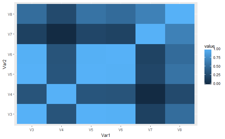
plot_tile <- plot + geom_tile()
Adding the color scale to other than default
plot_fill_color <- plot_tile + scale_fill_gradient2(low = "#132B43",high ="#56B1F7"
,mid = "white")
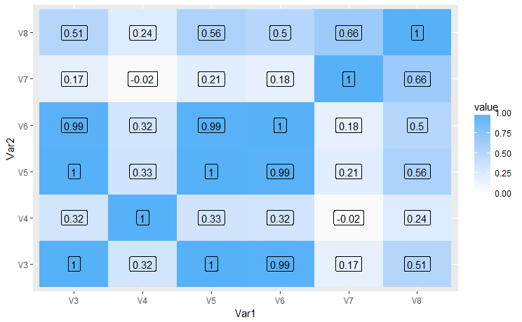
Adding correlation values(as label) to the plot
plot_label <- plot_fill_color + geom_text()
If you want to add box to the label as shown in the image below.
plot_label_box <- plot_label + geom_label()
There are more changes which can be done here like making it dynamic to choose the columns, adding tool tip, dynamic color scale etc. This was a basic intro about the correlation matrix heatmaps in R.
Sources and Read more
Data source , ggplot2, ggplot2, Melt in R, Data melting in R , Reshape package in R
Keep visiting Analytics Tuts for more tutorials.
Thanks for reading! Comment your suggestion and queries.


Pingback: Correlation matrix in Excel, Python and R – Analytics Tuts