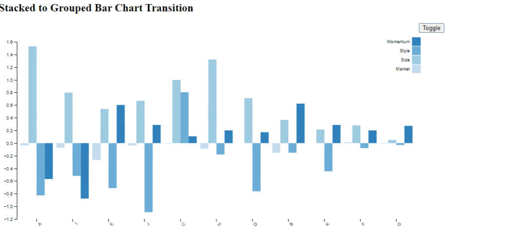
Stack bar chart to bar chart transition using d3
Hello friends! I was working on some visualization in d3 and Stack bar chart to bar chart transition using d3. Sample code and working code is uploaded in the GitHub.
Data visualization is a powerful tool for conveying complex information in an accessible and visually appealing manner. Among the many libraries available, D3.js stands out for its flexibility and robustness in creating dynamic and interactive visualizations. In this blog post, we will explore how to transition from a stacked bar chart to a bar chart using D3.js.

Understanding the Basics
Before diving into the implementation, let’s briefly review what stacked bar charts and bar charts are.
- Stacked Bar Chart: This type of chart segments each bar into sub-bars that represent different categories. It’s useful for comparing the parts to the whole across categories.
- Bar Chart: A bar chart represents data with rectangular bars, where the length of the bar is proportional to the value it represents. This type is great for comparing different categories directly.
Setting Up D3.js
To get started, ensure you have D3.js included in your project.
<script src="https://d3js.org/d3.v7.min.js"></script>Creating the Initial Stacked Bar Chart
Let’s start by creating a stacked bar chart. Here is a simple example with some sample data:
const data = [
{ category: 'A', part1: 30, part2: 20 },
{ category: 'B', part1: 40, part2: 10 },
{ category: 'C', part1: 20, part2: 30 },
];
// Set up the dimensions and margins
const margin = { top: 20, right: 30, bottom: 40, left: 40 },
width = 500 - margin.left - margin.right,
height = 300 - margin.top - margin.bottom;
const svg = d3.select("body").append("svg")
.attr("width", width + margin.left + margin.right)
.attr("height", height + margin.top + margin.bottom)
.append("g")
.attr("transform", `translate(${margin.left},${margin.top})`);
// Set up the scales
const x = d3.scaleBand()
.domain(data.map(d => d.category))
.range([0, width])
.padding(0.1);
const y = d3.scaleLinear()
.domain([0, d3.max(data, d => d.part1 + d.part2)])
.nice()
.range([height, 0]);
const color = d3.scaleOrdinal()
.domain(["part1", "part2"])
.range(["#1f77b4", "#ff7f0e"]);
// Stack the data
const stack = d3.stack()
.keys(["part1", "part2"]);
const stackedData = stack(data);
// Add the bars
svg.selectAll(".layer")
.data(stackedData)
.enter().append("g")
.attr("class", "layer")
.attr("fill", d => color(d.key))
.selectAll("rect")
.data(d => d)
.enter().append("rect")
.attr("x", d => x(d.data.category))
.attr("y", d => y(d[1]))
.attr("height", d => y(d[0]) - y(d[1]))
.attr("width", x.bandwidth());
// Add the axes
svg.append("g")
.attr("class", "axis x-axis")
.attr("transform", `translate(0,${height})`)
.call(d3.axisBottom(x));
svg.append("g")
.attr("class", "axis y-axis")
.call(d3.axisLeft(y));
Transitioning to a Bar Chart
Now, we’ll create a function to transition the stacked bar chart into a standard bar chart. This involves modifying the
y
position,
height
, and
fill
of the rectangles.
function transitionToBarChart() {
// Update the y scale to match the new maximum value
y.domain([0, d3.max(data, d => Math.max(d.part1, d.part2))]).nice();
// Update the y-axis
svg.select(".y-axis")
.transition()
.duration(1000)
.call(d3.axisLeft(y));
// Select the layers and transition to the new bar chart
svg.selectAll(".layer")
.selectAll("rect")
.transition()
.duration(1000)
.attr("y", d => y(d[1] - d[0]))
.attr("height", d => y(0) - y(d[1] - d[0]))
.attr("fill", (d, i) => color(d[0] ? "part2" : "part1"));
}
// Call the transition function
transitionToBarChart();
This is about the Stack bar chart to bar chart transition using d3
Check the code in GitHub
Keep visiting Analytics Tuts for more tutorials.
Thanks for reading! Comment your suggestions and queries.
