Trend Arrow Chart in Excel
Trend Charts are very good visualization technique in my earlier post Trend Chart in Tableau. I have used Tableau for the Trend Chart. In this tutorial we’ll learn how to make Trend Charts in Excel and use of Alt Key Codes and Paste Special in Excel.
Step 1. Creating the formula and assigning the trend arrows(up or down)
Here we have two column for different years 2012 and 2013 having some values and we want to see the growth from 2012 to 2013. So the formula goes like this.
=IF(Condition,"Value if condition is true", "Value if conditions is false")
In our case the formula will be and it is working as if the difference is positive then up arrow (▲) and if the difference is negative then down arrow (▼).
= IF(C3-B3>0,"▲","▼")
for up arrow Press ALT+30 and for down arrow Press ALT+31
Here is the list of Alt Key Codes, you can use symbols of your choice.
and then select the cells in which you want to use trend arrows and then press CTRL+D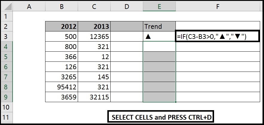
Step 2. Changing the color of Arrows
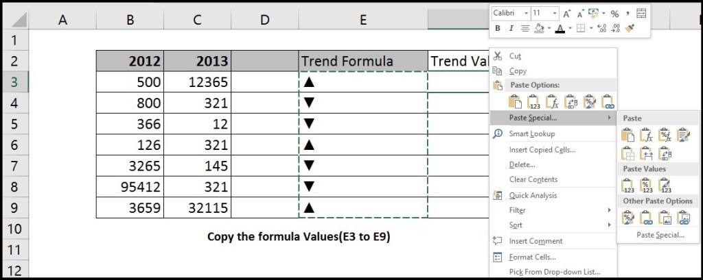
Copy the Trend arrow column(formula) and Paste to a new column using Paste special.
a. Right click column on the column you want to copy then click on the paste special
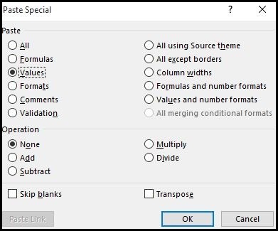
b. Then a window will open, click on the values and select Values under paste and click ok.
Now delete the original trend arrow column.
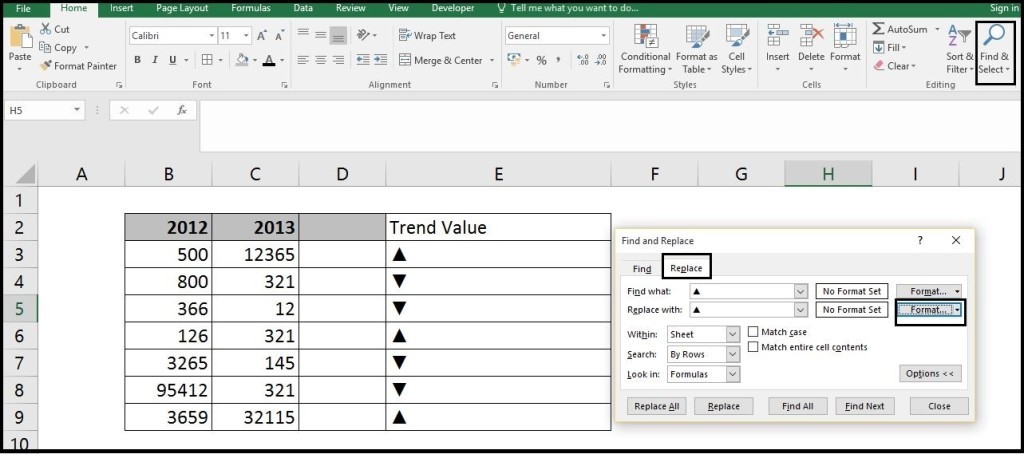
c. Now Press CTRL+F (Find) or Click the find and select from the Editing Group, a window will appear for find and replace.
From the replace section in the Find what box type Alt+30 for up arrow and in the replace with type Alt+30 and click on format.
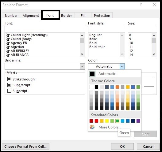
Then from the Replace format window select Font section and select color as Green and click Ok and then Click on Replace All.
Do the same for Down arrow select color as Red
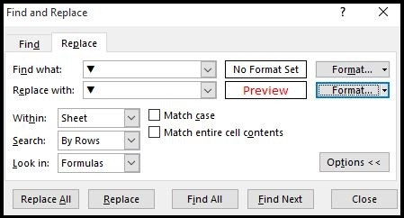
Note: In Step 2 we deleted the formula column and pasted only values because the find and replace will not work as we want.

you can use Format Cell ( Custom -> Type-> [Blue]▲;[Red]▼ )
Thanks very nice blog!