
Upset Plot in R
Hello Friends!! In the world of data visualization, representing the overlap between multiple sets can be tricky. Traditional methods like Venn diagrams quickly become cluttered when dealing with more than three sets, making it difficult to interpret relationships within the data.
This is where UpSet plots come in—a powerful alternative that provides a structured and scalable way to visualize set intersections.
In this blog, we’ll explore how to create UpSet plots in R using the UpSetR package and apply them to a movie genre dataset to analyze how movies belong to different genres.
Why Use UpSet Plots?
UpSet plots provide a more effective way to visualize set intersections than Venn diagrams. Instead of overlapping circles, UpSet plots use bar charts to represent both the size of each set and the frequency of intersections.
Key Benefits of UpSet Plots:
- Handles multiple sets effectively – Unlike Venn diagrams, which become unreadable with more than three sets.
- Clearly displays set relationships – Uses structured bar charts instead of overlapping circles.
- Shows exact numbers – Makes it easy to interpret how many elements belong to each intersection.
- Highly customizable – Allows ordering, filtering, and annotations for deeper insights.
Getting Started with UpSet Plots in R
Step 1: Install and Load UpSetR
First, we need to install and load the UpSetR package in R.
install.packages("UpSetR") # Install the package if not already installed
library(UpSetR) # Load the package
Step 2: Creating a Movie Genre Dataset
For this example, let’s analyze a dataset of movies and their associated genres. Each movie can belong to multiple genres, and our goal is to visualize genre intersections using an UpSet plot.
movies <- data.frame(
Movie = c("Movie1", "Movie2", "Movie3", "Movie4", "Movie5", "Movie6"),
Action = c(1, 0, 1, 0, 1, 0),
Adventure = c(1, 1, 0, 0, 1, 1),
Drama = c(0, 1, 1, 1, 0, 0),
Romance = c(0, 1, 1, 1, 0, 0),
Thriller = c(1, 0, 0, 1, 0, 1),
Horror = c(0, 0, 0, 1, 1, 1)
)
Understanding the Data Structure
- Each row represents a movie.
- Columns represent genres (Action, Adventure, Drama, Romance, Thriller, Horror).
- A value of 1 means the movie belongs to that genre, while 0 means it does not.
For example:
- Movie1 belongs to Action, Adventure, and Thriller.
- Movie4 belongs to Drama, Romance, Thriller, and Horror.
- Movie6 belongs to Adventure, Thriller, and Horror.
Step 3: Generating the UpSet Plot
Now, let’s use the upset() function to visualize how these genres overlap.
upset(movies, sets = c("Action", "Adventure", "Drama", "Romance", "Thriller", "Horror"), sets.bar.color = "blue", order.by = "freq")
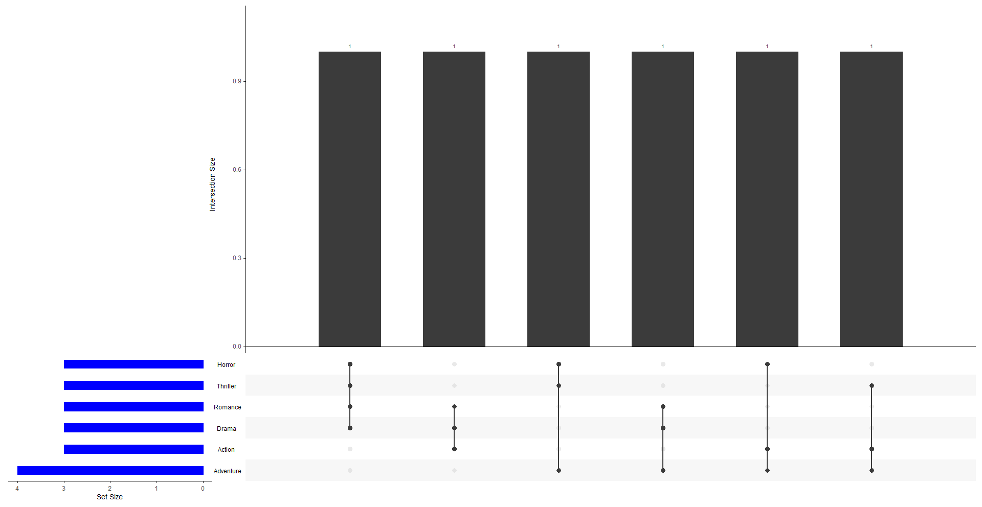
How to Interpret the UpSet Plot:
- Vertical bars (top panel) show the count of movies in each intersection (e.g., Action & Thriller, Drama & Romance, etc.).
- Horizontal bars (left panel) show the total number of movies in each genre.
- The dots below the vertical bars indicate which genres contribute to each intersection.
For example, if a vertical bar corresponds to Action & Adventure, and the bar height is 3, that means 3 movies belong to both these genres.
Step 4: Customizing the UpSet Plot
The UpSetR package allows customization to enhance the plot’s readability.
Sort intersections by number of movies:
upset(movies, sets = c("Action", "Adventure", "Drama", "Romance", "Thriller", "Horror"),sets.bar.color = "blue", order.by = "degree")
Add numerical labels on bars for better readability:
upset(movies, sets = c("Action", "Adventure", "Drama", "Romance", "Thriller", "Horror"), show.numbers = "yes", order.by = "freq")
Change bar colors for better distinction:
upset(movies, sets = c("Action", "Adventure", "Drama", "Romance", "Thriller", "Horror"),sets.bar.color = "red", order.by = "freq")
These modifications can enhance the clarity and effectiveness of your visualization.
Why UpSet Plots Are Better Than Venn Diagrams
| Feature | UpSet Plot | Venn Diagram |
|---|---|---|
| Handles multiple sets | Easily visualizes many sets | Overlaps make it unreadable |
| Shows exact numbers | Displays frequency for each intersection | Hard to determine exact counts |
| Highly customizable | Allows filtering, sorting, and annotations | Limited customization |
| Interpretability | Uses bars and dots for clarity | Overlapping circles can be confusing |
While Venn diagrams work well for small datasets, they become complex with more than three sets. UpSet plots solve this issue by providing a structured approach to analyzing multiple intersecting sets.
Conclusion
UpSet plots are an excellent way to visualize complex set intersections and gain insights from multicategorical datasets. Using the UpSetR package in R, we can efficiently create these plots and customize them to better suit our data.
In this tutorial, we applied UpSet plots to a movie dataset to analyze how different genres overlap across movies. This approach can be extended to many other domains, such as:
Movie industry – Analyzing multi-genre movies.
Biology – Studying gene mutations and disease overlaps.
Survey Data – Understanding customer preferences across different categories.
Try creating your own UpSet plot using your dataset and explore the insights it reveals!
Keep visiting Analytics Tuts for more tutorials.
Thanks for reading! Comment your suggestions and queries.
Pingback: Upset Plot in Python - Analytics Tuts