Visualize LinkedIn Connections
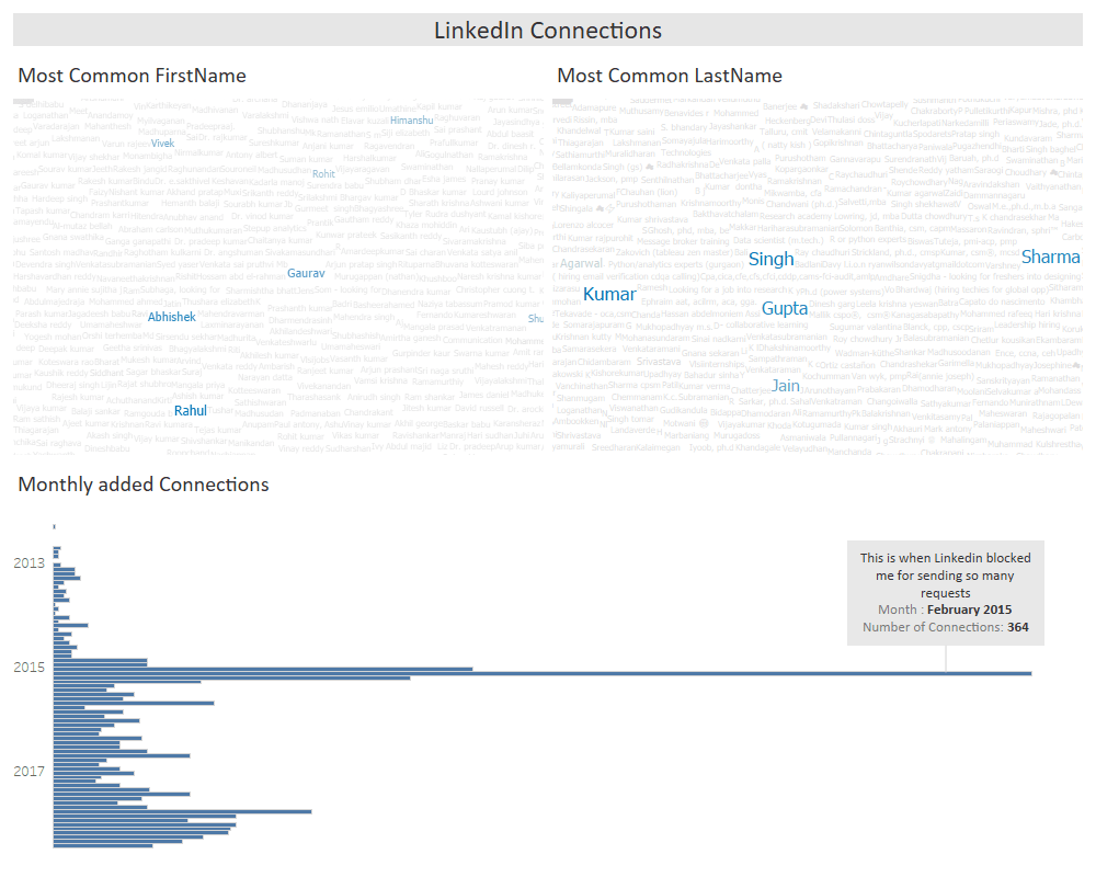
I exported my LinkedIn and tried to get some insights with the data. I’ve created a basic dashboard with some of the findings.
You can also export your LinkedIn connections using this link and try visualizing it.
There is very famous dialogue from Shah Rukh Khan’s movie is “Rahul – Naam to suna hoga”. Which I also found in my connections, most common male first name is Rahul and most common female first name is Neha.
Kumar and Gupta are the few most common last names in my connections.
Also you’ll see a spike in Feb’2015 in Monthly added connections sheet because that time I was in my last semester of my undergrad and was looking job. I started using LinkedIn very actively and was randomly send requests and got blocked by LinkedIn for too many requests sent.
Keep visiting Analytics Tuts for more tutorials. Share your dashboards and findings.
Thanks for reading! Comment your suggestion and queries.

